
Context
Feedback Into a Black Box
TherMOOstat collects temperature feedback from 45,000+ students, faculty, and staff at UC Davis. But users had no way of knowing if their input made any difference. I redesigned the site to close that loop, educating users on energy concepts and making the impact of their feedback visible.
my role
UX Design and content restructure.
Final site delivery.
goals
Educate users on energy concepts.
Show real impact of feedback.
The Problem
Users Had to Choose Before They Could Explore

Proposed map screen
I tested the prototype with five students to confirm the problem before redesigning anything.
When I joined the project, the team was finalizing a three-map user experience. Users select one of three maps to explore past data. I found this unnecessarily complicated and worried it would complicate things for those unfamiliar with the site.
initial testing
five students struggle to navigate
This quick test helped validate my initial assumptions. I created a task-based script and observed students as they walked through the experience, noting where the journey felt unclear. I synthesized my observations into these key pain points.
Pain Points
Concept Confusion · Redundancy · Flow Friction · Cognitive Overload
designs fell short on education and impact
Navigation was confusing, so the interface didn’t read as a coherent journey. As a result, users could not explore educational content or understand how their feedback led to change.
next rendition
I then presented my findings to my team and was asked to create a redesign that dealt with the issues found. I began with an information synthesis.
research
Cutting What Didn't Earn Its Place
I evaluated every content element against our two goals: educate users and prove their feedback drives change. Anything that didn't serve at least one of those goals was cut.
WHAT STAYED
Success Stories · Link to Comfort101 · Campus-Wide Data · Vote Breakdown Graph
WHAT was cut
Tip Map · Three Map System · Extended Onboarding
Each cut added steps without adding meaning.
MY REASONING
This was the most important decision in the project. It's easy to add features — it's harder to argue for removing them. I used the two-goal framework so every cut had a defensible reason. That made the team conversation straightforward: not "I think this is confusing" but "this doesn't educate or prove impact, so it goes."
To understand how different users would move through the redesign, I mapped two experience journeys.
I presented the framework to the team. Instead of defending opinions, we were evaluating content against shared goals — the cuts were straightforward.
Every decision traced back to the same two goals we started with: educate users, and prove their feedback drives change.
experience journeys for two users
As a student at the university, I was immersed enough to recognize and create journey experiences for two re-emerging personas: the doubtful and potential users.
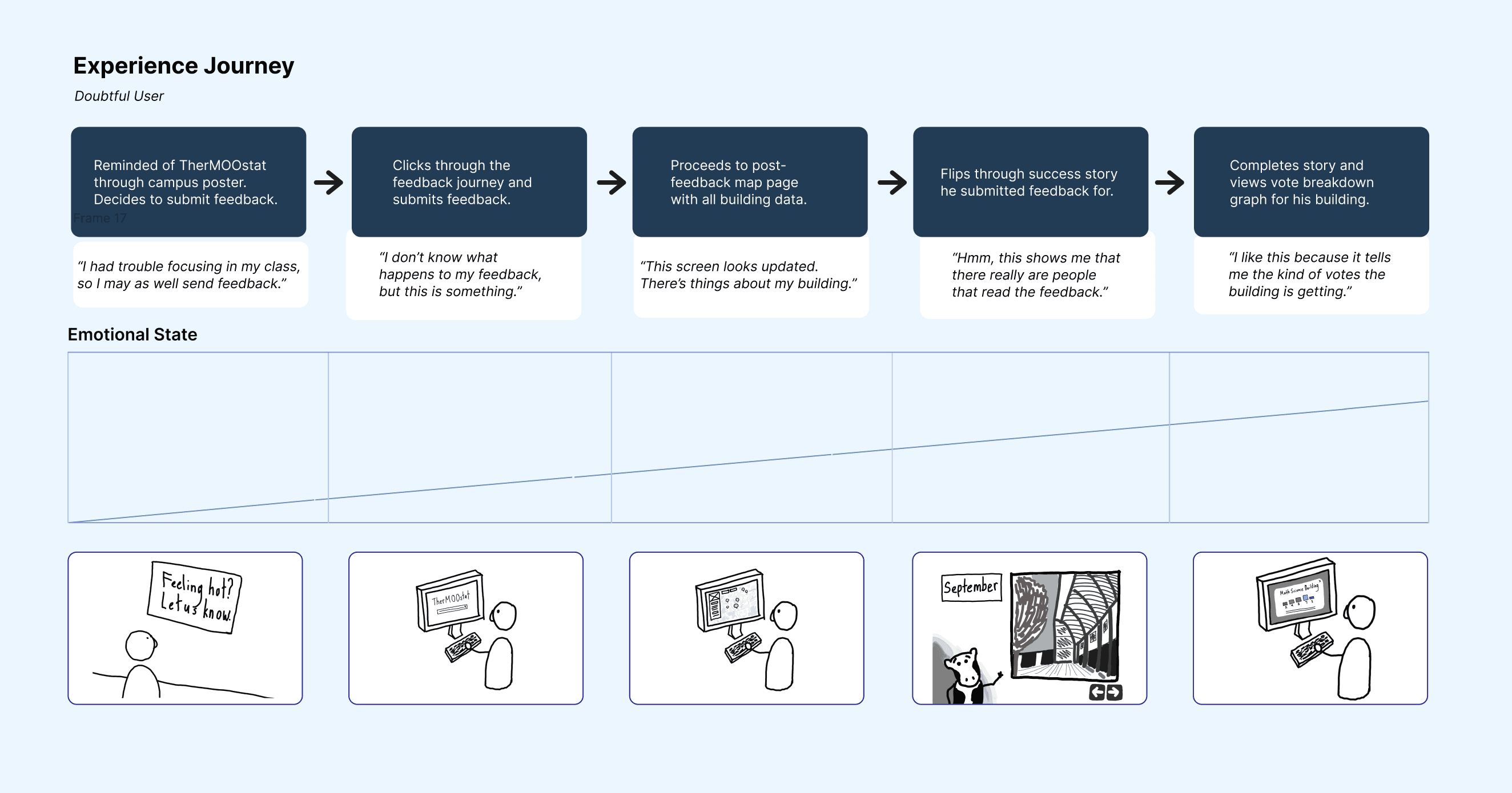
Experience journey map for the doubtful user persona.
time to ideate
Now that our team had a solid understanding of the high-impact information and ideal user experience, we proceeded to the ideation stage.
early concept
a unified map
The three-map structure forced users to make a choice before they understood what they were looking at. I consolidated everything into a single map hub.

Early concept of the map screen.
Tested Again, Refined Further
I brought the original five testers back through the updated journey. Two changes came directly from what they flagged. The feedback submission CTA moved to the top because testers kept scrolling past it, and the story bubble was redesigned as a narrative card because the bubble format felt too lightweight to trust.
Success Stories
Feedback that led to real fixes, told as short narratives. The most direct way to prove to users that their input mattered.
BUILDING SIDE BAR
Key building info surfaced on click, modeled on Google Maps familiarity. Users already knew this pattern so it required no learning.
ONE COMFORT TIP
Moved into the sidebar. Tips are useful but secondary, keeping one visible without letting it dominate kept the hierarchy honest.
final design
The map prioritizes success stories and building data.
Success stories show how our team fix temperature issues.
Validation testing
We tested with 20 UC Davis students to validate our designs.
Map Markers
85%
Understood vote size and color
Vote Breakdown Graph
65%
Improved understanding of trends
map filters
75%
Found filtering intuitive and useful
looking back
Lessons Learned
COMMUNICATE EARLY
I was hesitant to push back at first. Once I paired my usability concerns with data from testing, the team moved quickly. Having evidence made the conversation about the work, not opinion.
LESS IS MORE
Not every feature earns its place. Using a two-goal framework to evaluate content made cuts defensible and kept the team aligned on what the site was actually for.
DESIGN FOR THE SKEPTIC
The users most likely to dismiss the site were exactly the ones we needed to convince. Designing for doubt, showing real data and real outcomes, made the experience stronger for everyone.
the solution
A quick Look for those skimming

A single unified map that teaches users about energy and shows the impact of their feedback.

Let's build something together.
© 2026 Alexandra Litinskiy